This is so great.
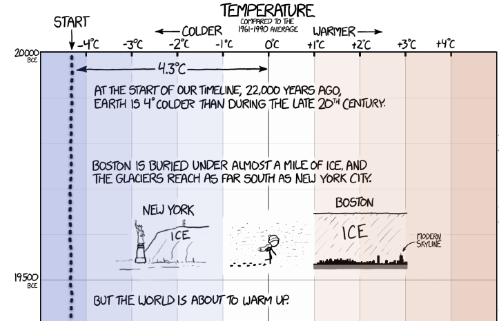
A Timeline of Earth’s Average Temperature by xkcd.
“When people say ‘The climate has changed before,’ these are the kinds of changes they are talking about.” —xkcd.

This is so great.
A Timeline of Earth’s Average Temperature by xkcd.
“When people say ‘The climate has changed before,’ these are the kinds of changes they are talking about.” —xkcd.
I love BEST OF lists. Here is a compilation of some of my favorite 2014 Best of Lists, updated periodically.
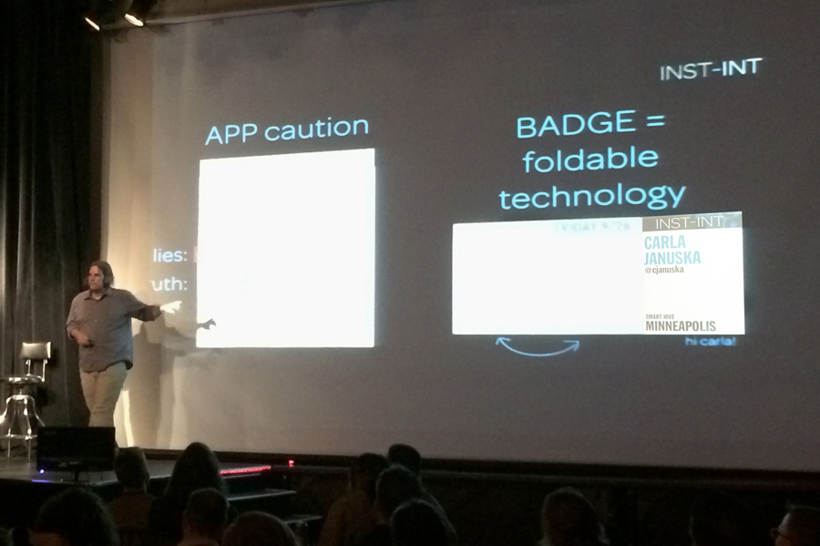
This was the first year I attended INST-INT and I was impressed with the caliber of the presentations, the feeling of community and the amazing, innovative work shown. INST-INT 2014 was a wonderful combination of the best installation, environment and immersive experience design with a focus on how it works (and when it doesn’t work), who gets involved, and how can we collaborate together. (At least 4 speakers asked for collaborators while on stage.)
It was an amazingly relaxed, collegial vibe with everyone feeling both inspired and in awe of the work shown, the efforts put forth and the multi-disciplinary talents of the speakers. Getting off the screen and into the world around us was the goal and the Read More
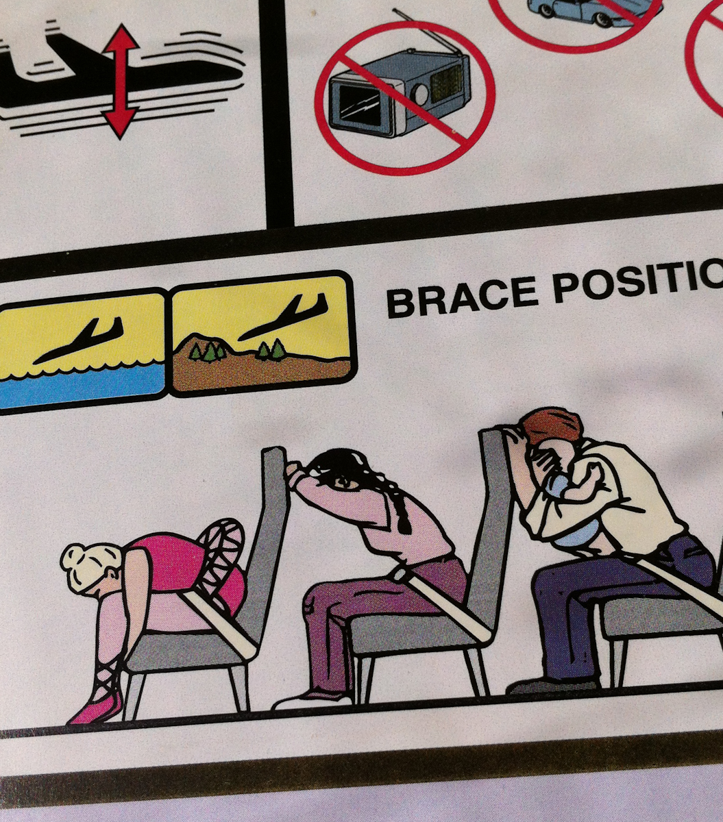
I’m always looking closely at instructional, informational graphics. Airline emergency instructional cards are one of my favorites to examine. They need to communicate with a minimum of written copy, they need to be clear and they have a captive audience.
You can not imagine my happiness when saw this flight instruction card for my recent Sun Country flight. Low and behold, an easter egg on the brace position graphic: a ballerina is the first person pictured in illustration. She appears nowhere else in the flight instructions. No other unusual characters are shown. I don’t know why a ballerina was included, but whoever created this tidbit made my flight. Read More
Sometimes the simplest visualizations are just enjoyable, especially when they give you a little insight into something you encounter in your own day. Emojitracker.com is a realtime visualization of emoji use on twitter. In our increasingly visualized world, emoji has become shorthand for emotions in texts, email and social media. So Emojitracker show us just who uses what to signify emotions on twitter. It’s simple and it’s fun. ☆☆☆☆☆