(function(i,s,o,g,r,a,m){i['GoogleAnalyticsObject']=r;i[r]=i[r]||function(){ (i[r].q=i[r].q||[]).push(arguments)},i[r].l=1*new Date();a=s.createElement(o), m=s.getElementsByTagName(o)[0];a.async=1;a.src=g;m.parentNode.insertBefore(a,m) })(window,document,'script','//www.google-analytics.com/analytics.js','ga'); ga('create', 'UA-41959290-1', 'smarthive.com'); ga('send', 'pageview');

The Cost of Failure of the Equal Rights Amendment — Infographic

By | Content, Information Design

Failure of the Equal Rights Amendment

When Phyllis Schlafly died recently, many obituaries remembered her opposition to the Equal Rights Amendment to the U.S. Constitution. The amendment stated that the rights guaranteed Constitution apply equally to all persons regardless of their sex. Schlafly was able to evoke fear of changes to the draft, single-sex restrooms and child custody laws to Read More

2014 best of lists

By | Content, Data Visualization, Information Design, Just Awesome

I love BEST OF lists. Here is a compilation of some of my favorite 2014 Best of Lists, updated periodically.

3D world cup data vis ball

World Cup 3D Data Visualization

By | Data Visualization, Design, Information Design

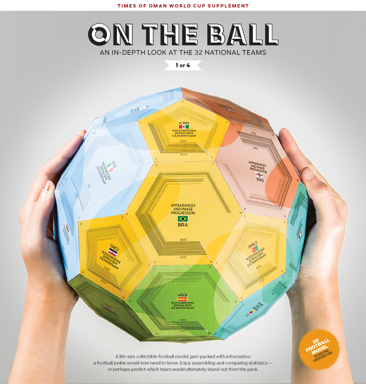
When I am talking about data, design and math all coming together in amazing ways to create data visualizations, this is what I am talking about. Check out this amazing 3D data visualization and the process to create it on Visual Loop. 

3D World Cup Dataviz Ball, by Times of Oman

While I love the data visualization itself, the process to create it is what is most insightful. Here we see the designer’s thought process, sketches, paths-not-taken and just how much data needed to be managed to create the end result. It takes a special combination of brain power and creativity to pull it all together into one accurate, engaging visualization. And we can see how many ideas and options are possible once the data is available to play with. I really admire this piece and I don’t even really care about soccer/football.


Ballerina on flight card

Infographic easter egg—a ballerina

By | Information Design, Just Awesome

I’m always looking closely at instructional, informational graphics. Airline emergency instructional cards are one of my favorites to examine. They need to communicate with a minimum of written copy, they need to be clear and they have a captive audience.

You can not imagine my happiness when  saw this flight instruction card for my recent Sun Country flight. Low and behold, an easter egg on the brace position graphic: a ballerina is the first person pictured in illustration. She appears nowhere else in the flight instructions. No other unusual characters are shown. I don’t know why a ballerina was included, but whoever created this tidbit made my flight. Read More

carla at eyeo festival 2011

Why I started Smart Hive

By | Creativity, Data Visualization, Information Design

I decided to start Smart Hive, an agency focused on information design, data visualization and creative strategy, because I got a email. Out of the blue, in 2011, I received a promotional announcement for a conference in the Twin Cities called Eyeo Festival. I had never heard of it before because it never existed before. Dave Shroeder, founder of PilotVibe and Flashbelt, Jer Thorp, data visualist, and Wes Grubbs, founder of Pitch Interactive, dreamt up a conference focusing on the growing convergence of art, data visualization, creative code and media arts. Read More