(function(i,s,o,g,r,a,m){i['GoogleAnalyticsObject']=r;i[r]=i[r]||function(){ (i[r].q=i[r].q||[]).push(arguments)},i[r].l=1*new Date();a=s.createElement(o), m=s.getElementsByTagName(o)[0];a.async=1;a.src=g;m.parentNode.insertBefore(a,m) })(window,document,'script','//www.google-analytics.com/analytics.js','ga'); ga('create', 'UA-41959290-1', 'smarthive.com'); ga('send', 'pageview');

Data journalism + content marketing

By | Content, Strategy

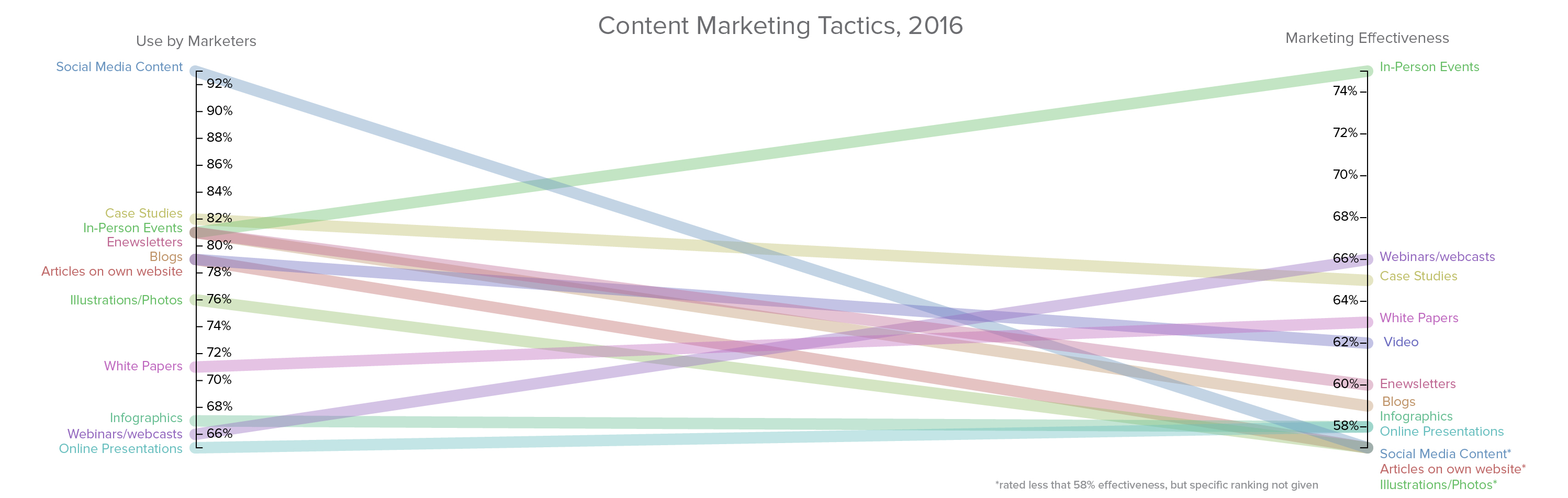
Content marketing is very popular. 88% of marketers say they use content marketing and three-quarters of all marketers plan on producing more this year. That is a lot of content being generated on behalf of brands, despite the fact that 44% of marketers are neutral on its effectiveness. Despite having a huge number of forms of content to deliver—blogs, videos, infographics, slideshows, articles, listicles, webinars—the effectiveness of the content is really dependent upon the story of the content itself. If a brand’s story isn’t worth telling, is it really worth a listicle or motion graphic? Isn’t the real opportunity for content marketing in the data behind the story that behind the content marketing tactic? Read More

The Cost of Failure of the Equal Rights Amendment — Infographic

By | Content, Information Design

Failure of the Equal Rights Amendment

When Phyllis Schlafly died recently, many obituaries remembered her opposition to the Equal Rights Amendment to the U.S. Constitution. The amendment stated that the rights guaranteed Constitution apply equally to all persons regardless of their sex. Schlafly was able to evoke fear of changes to the draft, single-sex restrooms and child custody laws to Read More

2014 best of lists

By | Content, Data Visualization, Information Design, Just Awesome

I love BEST OF lists. Here is a compilation of some of my favorite 2014 Best of Lists, updated periodically.

National Park Acreage

National Parks acreage and visits visualization

By | Cartography, Content, Data Visualization

I was very inspired by the PBS documentary on the National Parks, America’s Best Idea. To understanding the extensive system of U.S. National Parks I used information from the National Parks Service and Google Fusion to create these maps of the U.S. National Parks acreage and visits.

Comparatively, the sheer size of Alaska and its national park lands (over 54 million acres) dwarfs that of the other 49 states. Hence using color to differentiate different quantities was difficult because Alaska is such an outlier. I ended up increasing the color scale so I had a wider range of values to better show scale. This Read More

Energy Heat Map

Mapping energy, exploring options

By | Cartography, Content, Data Visualization

I have been working on some different visualizations of data and needed to map data to a US map. There are a LOT of tools out there designed to make this process easier. I’ve been rolling around in a few of them and found some pros and cons for each. I wanted to visually show the amount of energy produced and consumed by each state in the U.S. This date is easily available in many forms at the US Energy Information Administration who provides their data in multiple, usable formats. Mapping energy data, even with the tools out there, turned out to be an interesting exploration. Read More