(function(i,s,o,g,r,a,m){i['GoogleAnalyticsObject']=r;i[r]=i[r]||function(){ (i[r].q=i[r].q||[]).push(arguments)},i[r].l=1*new Date();a=s.createElement(o), m=s.getElementsByTagName(o)[0];a.async=1;a.src=g;m.parentNode.insertBefore(a,m) })(window,document,'script','//www.google-analytics.com/analytics.js','ga'); ga('create', 'UA-41959290-1', 'smarthive.com'); ga('send', 'pageview');
National Park Acreage

National Parks acreage and visits visualization

By | Cartography, Content, Data Visualization

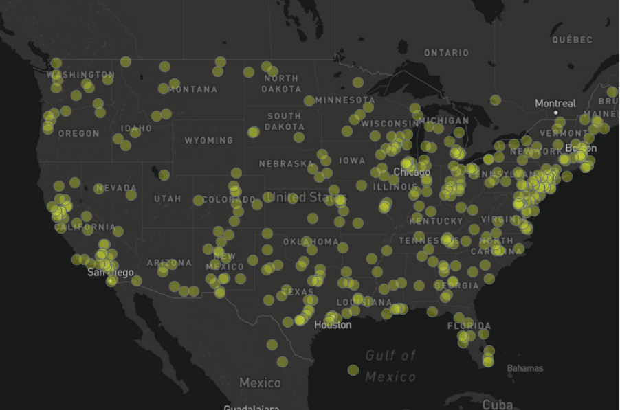
I was very inspired by the PBS documentary on the National Parks, America’s Best Idea. To understanding the extensive system of U.S. National Parks I used information from the National Parks Service and Google Fusion to create these maps of the U.S. National Parks acreage and visits.

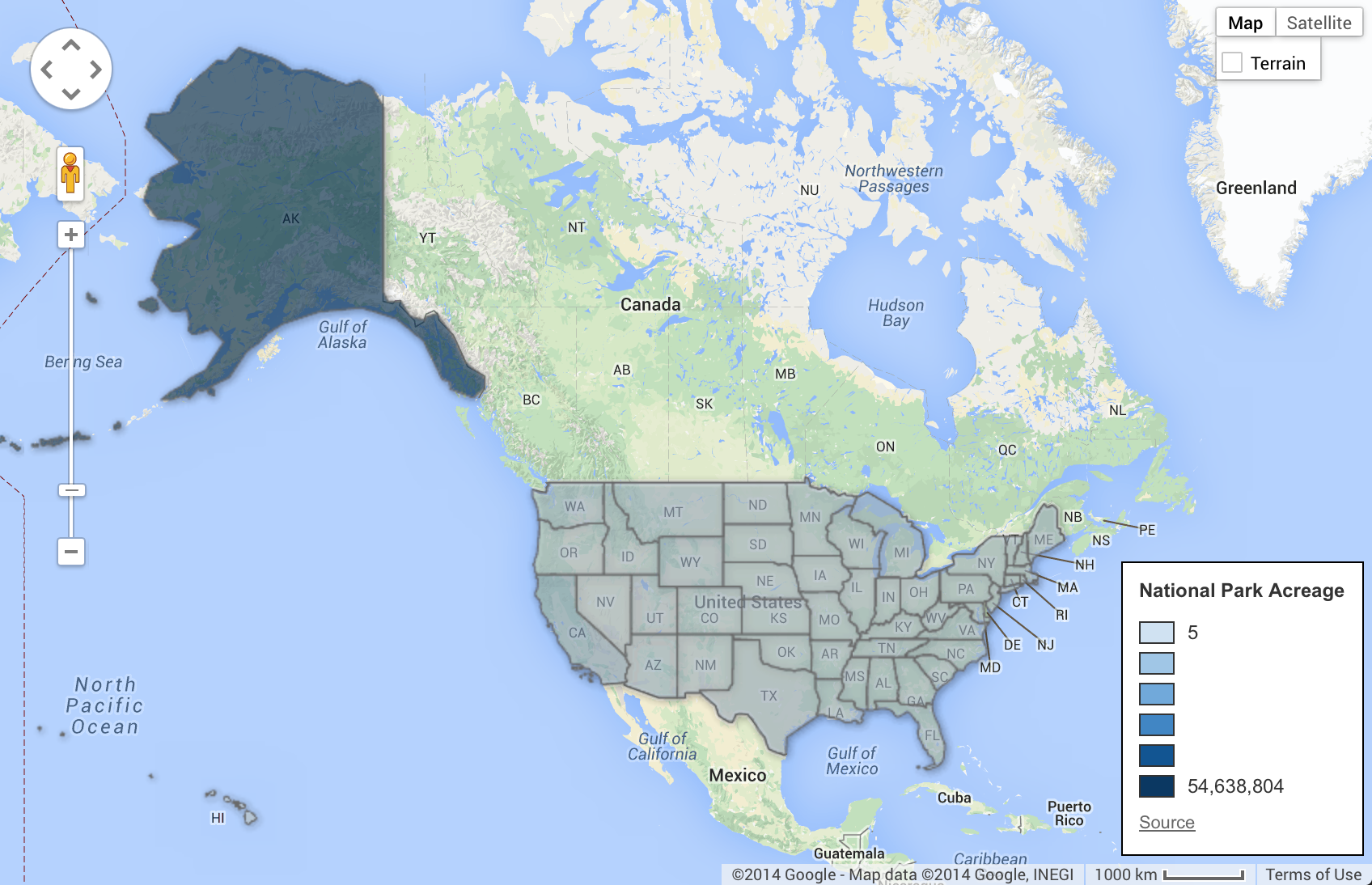
Comparatively, the sheer size of Alaska and its national park lands (over 54 million acres) dwarfs that of the other 49 states. Hence using color to differentiate different quantities was difficult because Alaska is such an outlier. I ended up increasing the color scale so I had a wider range of values to better show scale. This Read More

Energy Heat Map

Mapping energy, exploring options

By | Cartography, Content, Data Visualization

I have been working on some different visualizations of data and needed to map data to a US map. There are a LOT of tools out there designed to make this process easier. I’ve been rolling around in a few of them and found some pros and cons for each. I wanted to visually show the amount of energy produced and consumed by each state in the U.S. This date is easily available in many forms at the US Energy Information Administration who provides their data in multiple, usable formats. Mapping energy data, even with the tools out there, turned out to be an interesting exploration. Read More

Excellence in cartography visualizations

By | Cartography, Data Visualization

A recent article on Visual Loop had some excellent examples of cartographic visualization. It’s exciting to see so many exciting examples of cartography visualization and so many new tools being developed that increase our options for mapping data. I am especially interested in looking at data on maps in two ways, looking at non-traditional kinds of data mapped to geography and maps that take into account large data sets and make new insights possible. Read More