(function(i,s,o,g,r,a,m){i['GoogleAnalyticsObject']=r;i[r]=i[r]||function(){ (i[r].q=i[r].q||[]).push(arguments)},i[r].l=1*new Date();a=s.createElement(o), m=s.getElementsByTagName(o)[0];a.async=1;a.src=g;m.parentNode.insertBefore(a,m) })(window,document,'script','//www.google-analytics.com/analytics.js','ga'); ga('create', 'UA-41959290-1', 'smarthive.com'); ga('send', 'pageview');

2014 best of lists

By | Content, Data Visualization, Information Design, Just Awesome

I love BEST OF lists. Here is a compilation of some of my favorite 2014 Best of Lists, updated periodically.

INST-INT opening

INST-INT 2014

By | Data Visualization, Design, Just Awesome, Uncategorized

This was the first year I attended INST-INT and I was impressed with the caliber of the presentations, the feeling of community and the amazing, innovative work shown. INST-INT 2014 was a wonderful combination of the best installation, environment and immersive experience design with a focus on how it works (and when it doesn’t work), who gets involved, and how can we collaborate together. (At least 4 speakers asked for collaborators while on stage.)

It was an amazingly relaxed, collegial vibe with everyone feeling both inspired and in awe of the work shown, the efforts put forth and the multi-disciplinary talents of the speakers. Getting off the screen and into the world around us was the goal and the Read More

National Park Acreage

National Parks acreage and visits visualization

By | Cartography, Content, Data Visualization

I was very inspired by the PBS documentary on the National Parks, America’s Best Idea. To understanding the extensive system of U.S. National Parks I used information from the National Parks Service and Google Fusion to create these maps of the U.S. National Parks acreage and visits.

Comparatively, the sheer size of Alaska and its national park lands (over 54 million acres) dwarfs that of the other 49 states. Hence using color to differentiate different quantities was difficult because Alaska is such an outlier. I ended up increasing the color scale so I had a wider range of values to better show scale. This Read More

3D world cup data vis ball

World Cup 3D Data Visualization

By | Data Visualization, Design, Information Design

When I am talking about data, design and math all coming together in amazing ways to create data visualizations, this is what I am talking about. Check out this amazing 3D data visualization and the process to create it on Visual Loop. 

3D World Cup Dataviz Ball, by Times of Oman

While I love the data visualization itself, the process to create it is what is most insightful. Here we see the designer’s thought process, sketches, paths-not-taken and just how much data needed to be managed to create the end result. It takes a special combination of brain power and creativity to pull it all together into one accurate, engaging visualization. And we can see how many ideas and options are possible once the data is available to play with. I really admire this piece and I don’t even really care about soccer/football.


Map of Pride Festivals

A map of Pride Festivals

By | Data Visualization

It is so heartening to consider the growth of civil rights for gay, lesbian, bisexual and transgendered people. Slow as it may seem and certainly we’ve faced setbacks, progress has been made.

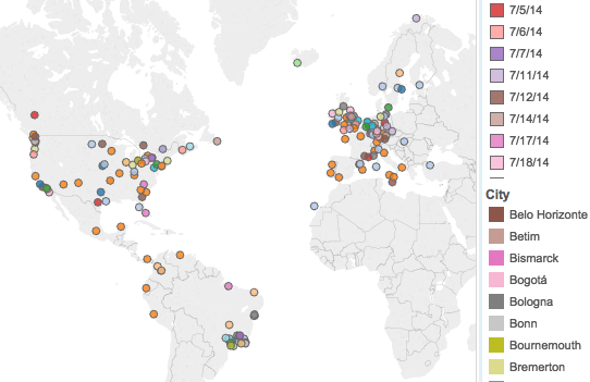
Pride festivals, annual gatherings of all kinds of people to celebrate the diversity, creativity and wonderfulness of the GLBT + friends community, are both promoters and barometers of our progress. Since it is pride weekend here in Minneapolis I thought it would be fun to try to map out pride festivals this year.

I found a good data set at GayScout.com and pulled it into Tableau. I wanted to let you see both the global spread of festivals as well as see that festivals aren’t only in the month of June. (Traditionally in the U.S. pride happens in June in remembrance of the Stonewall arrests in New York City.)

I’ll be looking at trying to augment my data set in the future with more specific information about pride festivals and hopefully create a richer experience—one that better shows the richness of our community.

Ballerina on flight card

Infographic easter egg—a ballerina

By | Information Design, Just Awesome

I’m always looking closely at instructional, informational graphics. Airline emergency instructional cards are one of my favorites to examine. They need to communicate with a minimum of written copy, they need to be clear and they have a captive audience.

You can not imagine my happiness when  saw this flight instruction card for my recent Sun Country flight. Low and behold, an easter egg on the brace position graphic: a ballerina is the first person pictured in illustration. She appears nowhere else in the flight instructions. No other unusual characters are shown. I don’t know why a ballerina was included, but whoever created this tidbit made my flight. Read More

Energy Heat Map

Mapping energy, exploring options

By | Cartography, Content, Data Visualization

I have been working on some different visualizations of data and needed to map data to a US map. There are a LOT of tools out there designed to make this process easier. I’ve been rolling around in a few of them and found some pros and cons for each. I wanted to visually show the amount of energy produced and consumed by each state in the U.S. This date is easily available in many forms at the US Energy Information Administration who provides their data in multiple, usable formats. Mapping energy data, even with the tools out there, turned out to be an interesting exploration. Read More

emojitracker.com

Emoji use on twitter, tracked in real time

By | Data Visualization, Just Awesome

Sometimes the simplest visualizations are just enjoyable, especially when they give you a little insight into something you encounter in your own day. Emojitracker.com is a realtime visualization of emoji use on twitter. In our increasingly visualized world, emoji has become shorthand for emotions in texts, email and social media. So Emojitracker show us just who uses what to signify emotions on twitter. It’s simple and it’s fun. ☆☆☆☆☆


Design Skills over time

Evolution of design skills

By | Data Visualization

Embarking on a new path is always exciting as I move into the unknown. I’ve been adding different skill sets to my repertoire as I focus more on data visualization and information design.

However, I thought it would be insightful to look at the various skills I’ve used in my career to date as I have moved from designer to Art Director to Creative Director to Entrepreneur. The tools, processes and approaches have evolved, as have my role in the creative process. To get a sense of the progression I created this visualization that shows the design skills I used in the past 20+ years and what percentage of my time I spent on them.

Skills Visualization

As with any visualization, I gathered the data first, from my own records and memory. Then I quantified it by percentage Read More

The best of the New York Times interactive storytelling and data visualization

By | Uncategorized

2013: The Year in Interactive Storytelling

I consider the work of the New York Times Graphic Dept. some of the best in class for both interactive storytelling and data visualization. I had the pleasure of hearing some of the members of the graphics team speak at the AIGA National Conference in Minneapolis last year and was impressed with their process and how they focus on getting the story told, sometimes under very fast time demands.

These works are some of the the best and I plan on pouring over them in the upcoming weeks. Enjoy.