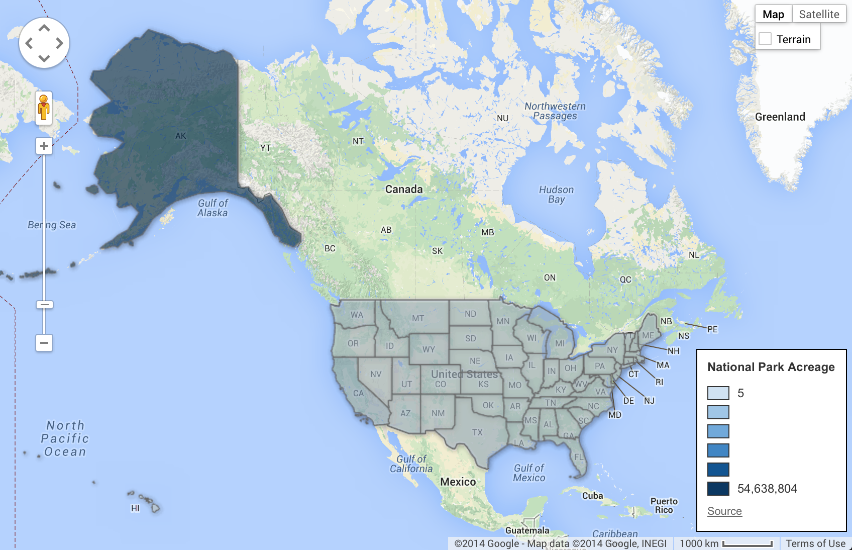
I was very inspired by the PBS documentary on the National Parks, America’s Best Idea. To understanding the extensive system of U.S. National Parks I used information from the National Parks Service and Google Fusion to create these maps of the U.S. National Parks acreage and visits.
Comparatively, the sheer size of Alaska and its national park lands (over 54 million acres) dwarfs that of the other 49 states. Hence using color to differentiate different quantities was difficult because Alaska is such an outlier. I ended up increasing the color scale so I had a wider range of values to better show scale. This meant high acreage states like California (0ver 8 million acres) showed up clearly on the map. Clicking on a state gives the viewer the specific data on each state.
Next, I created a similar map showing the number of recreational visitors to national parks within the US by state. This gave me a better sense of the demands on the park system as well as the seeing some of the growth story show in the PBS special. Future visualizations will look at sharing data on the parks in a more granular way.
href="https://staging.smarthive.com/contact/" data-color-override="false" data-hover-color-override="false" data-hover-text-color-override="#fff">Button Text