I have been working on some different visualizations of data and needed to map data to a US map. There are a LOT of tools out there designed to make this process easier. I’ve been rolling around in a few of them and found some pros and cons for each. I wanted to visually show the amount of energy produced and consumed by each state in the U.S. This date is easily available in many forms at the US Energy Information Administration who provides their data in multiple, usable formats. Mapping energy data, even with the tools out there, turned out to be an interesting exploration.
Mapping
Initially, I wanted a heat map treatment for the map, so I used Google Fusion Tables to work with the data. I could only visualize one aspect of the data, the consumption of energy, and then use a click state to give the user deeper levels of information. Google Fusion tables is a little tricky to understand and unfortunately harder to style than I wished. Still it let me geolocate my date easily and quickly and it’s live. In the end I was happy with the functionality but not the styling.
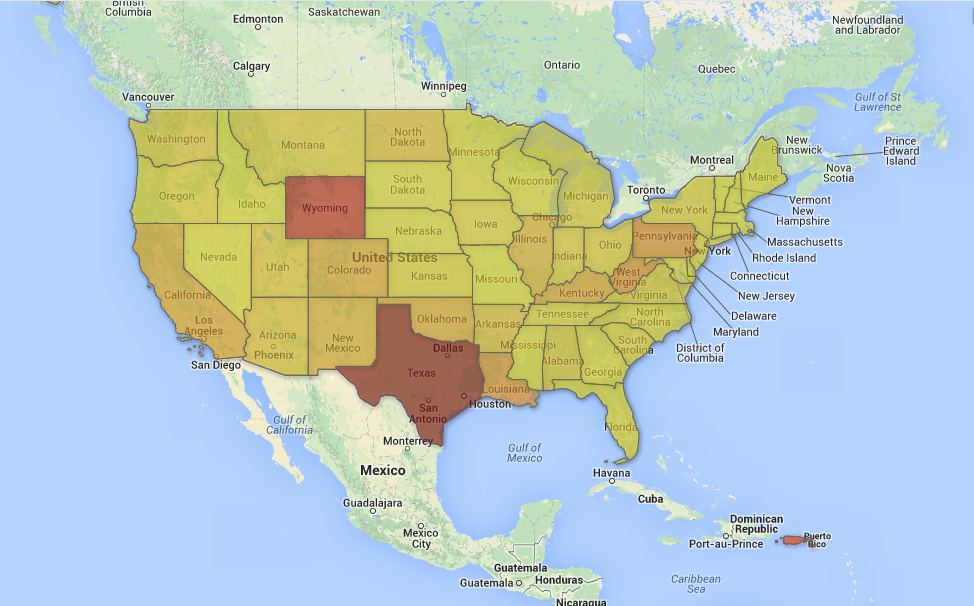
Second I used TileMill to try to create a version of the map showing the contrast of energy production vs. energy consumption using color-coded, size-coded data points on a map. TileMill let me find and download shape files of the world pretty easily. And it worked well with my data once I formatted my CSV file correctly. The most interesting part of TileMill is its language Carto which is a styling language similar to CSS. I found it relatively easy to use and it allowed me to pretty quickly mock-up the map I wanted. Unfortunately, once I saw the final result I realized this visualization method didn’t communicate. It’s too difficult to mentally compare consumption and production using color and size of circles. So back to the data. In the end I backed up and looked more closely at all of the data available to see what would be meaningful to a user.
Charting
Ultimately, a simple stacked area chart was the best way to tell a relevant story. The differences in consumption vs. production mapped out by state, wasn’t really compelling. Instead, the real story was in the overall US data and its outlook on four major energy factors: consumption, production, imports and export. Here we can see a drop in the rate of energy consumption and a lessoning trend in importing energy, primarily oil.